
Change property values smoothly, over a given duration
.animate-opacity{animation:opac 0.8s}
@keyframes opac{from{opacity:0} to{opacity:1}}
transition

transition-delay

transition-duration

transition-property

transition-timing-function
Example
HTML
<div>This is cool </div>
CSS
div {
  background: yellow;
  padding: 5px 5px;
  transition: border 2s, transform 1s,margin 1s, width 1s;
  border-bottom: 1px solid #ff000000;

}
div:hover {
  border-bottom: 1px solid red;
  transform: translateX(10px);
}
div {
	font-size: 20px;
    margin-left: 5px;
    position: relative;
    width: calc(99% - 5px);
}
div:before {
	position:absolute;
    content: "";
    height: 1px;
    background: #000;
    width: 0px;
    margin-left: -25px;
    top: 50%;
    transition: width 1s;
}
div:hover {
	margin-left: 25px;
	width: calc(99% - 35px);
}
div:hover:before {
	width: 15px;
}
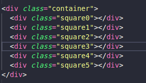
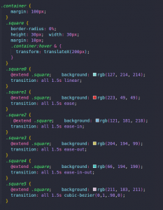
Example 2
HTML
SCSS
Leave A Comment?